(Work)
Sequel
Building a brand that’s easy on the eyes
Intro
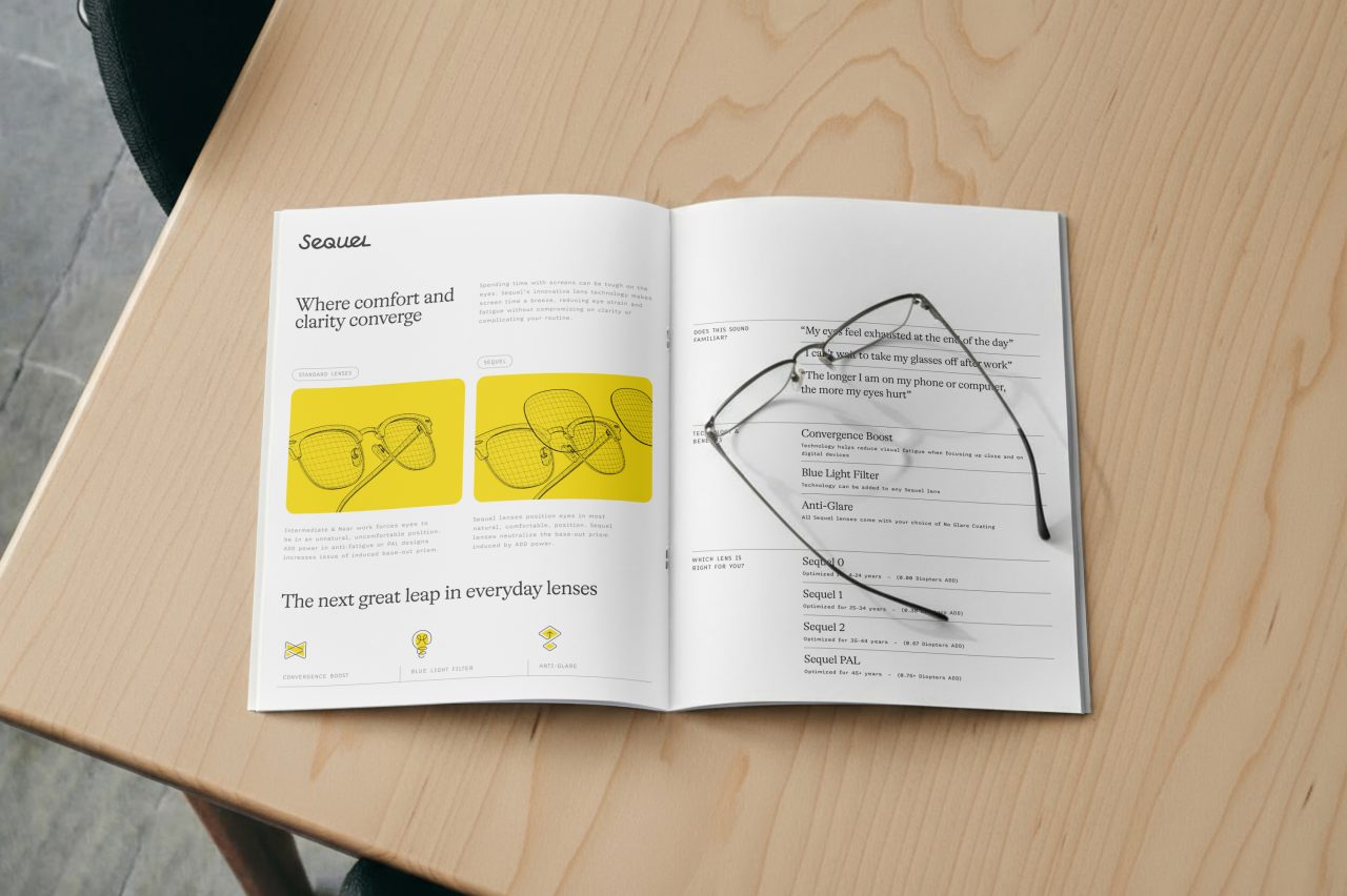
The next great leap in everyday lenses
Launching a new brand can be intimidating, especially when the new thing is the greatest thing since sliced bread (at least, we think so). But when our friends at Newton™ reached out for help branding their first foray into everyday lenses, we didn’t freak out. We geeked out. Their mission? Launch lenses built for a modern lifestyle. Ours? Build (and name) a brand that looks as good as life through their lens.
Imbuing life into an exciting new offering without overshadowing the parent brand can feel like walking a tightrope. Newton is an established leader in therapeutic lenses, with hard-won equity we didn’t want to dilute. Our solution was to create a house of brands — an architecture strategy that creates enough flexibility to accommodate everyday and therapeutic lenses and makes room for future innovations.
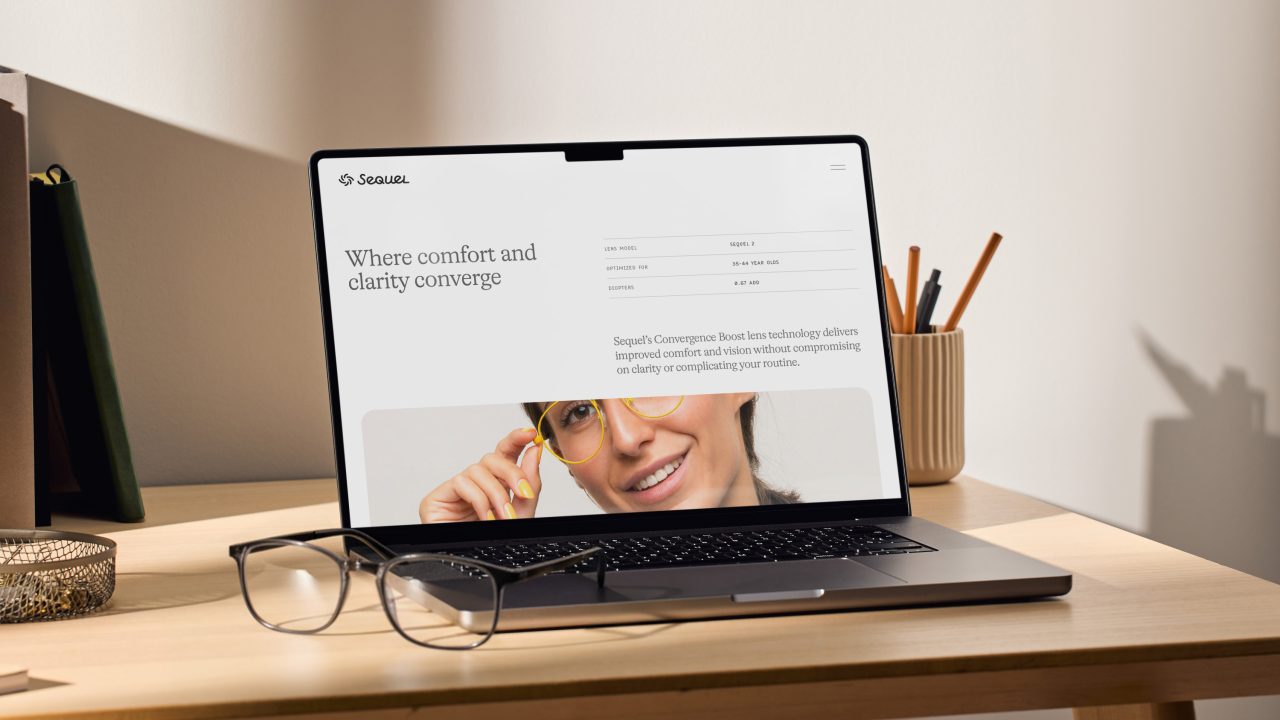
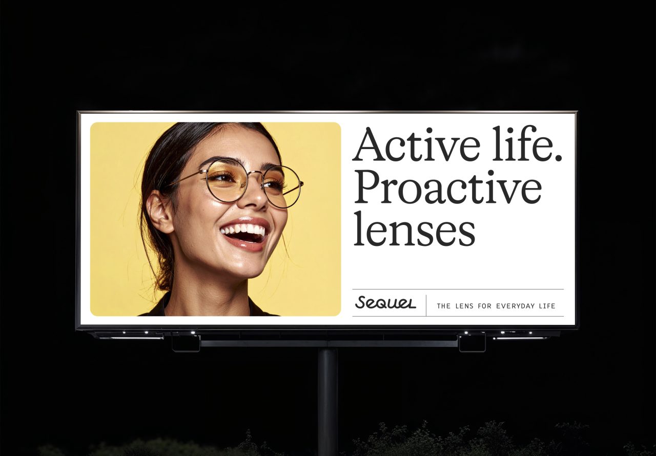
Sequel™ is a lens for anybody who spends all day on their screen, reducing eye strain by encouraging better eye alignment at close distances. The name itself is a reference to the product’s function: helping wearers see more comfortably by quelling eye strain. Add the fact that Sequel is also Newton’s second major product launch, and it doesn’t take an expert to see why we loved the name.
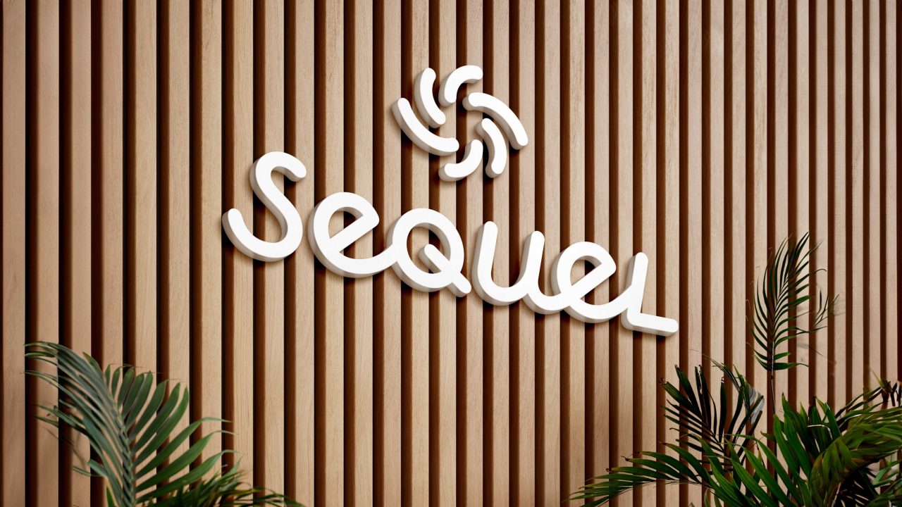
Inspired by a positioning centered around the idea of easing the everyday, the new Sequel logo is similarly easygoing. The custom-drawn wordmark is friendly and approachable, a welcome departure from blue-light blockers and other semi-competitive products. The script is complemented by a lively and familiar pinwheel symbol abstract enough to reference an eye without feeling too on (or just above?) the nose.
The visual identity elevates the warm and friendly character of the logo, leading with a unique-in-market yellow — a strong contrast to the dominant blues and blacks among the competitive set. An intentionally limited typographic palette brings ample character to headline and detail moments, while wordmark-inspired iconography puts a new perspective on eye care.
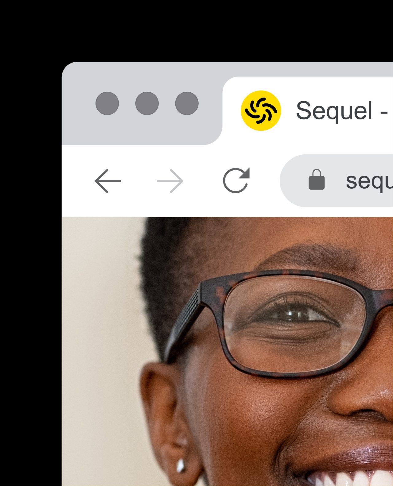
A more technical illustration style brings the benefits and function of the product into sharper focus, delivering a bit of the “science” the Newton brand is known for. Photography, on the other hand, was a curated set of AI-generated imagery to create a better-than-stock approach to brand imagery. We wanted the spirit of the photography to feel warm, candid, and stylish. The combined effect is a brand that feels grounded in science but not lost in it, prioritizing everyday outcomes over technical inputs.
The Sequel verbal identity is lighthearted and playful, adding a healthy dose of eye-catching wordplay to an identity that’s already majoring in friendly and fun. The messaging mix covers everything from function — Where comfort and clarity converge — to plain old fun — Your eyes have a favorite pair of glasses — creating a well-rounded toolkit to communicate the benefits of Sequel without losing sight of the core value proposition.
Whether you’re looking at the Sequel brand or through Sequel lenses, we want you to think the same thing: wow, this is easy on the eyes.
Thanks:
Thanks to the team at Newton for their enthusiasm and
collaboration throughout this project, as well as Neurolens.
Credits:
Designed by Sean O'Connor & Stephanie Kim
Strategy by Mitchell Ditto
Messaging by Cameron Leberecht
Animations by Cody Bass & Michael Martino
Creative Direction by Blake Howard
Project Management by Melissa Kruse
Might we suggest
Usalco
Case Study
Bon Secours Mercy Health
Case Study
Net Health
Case Study
Open Hand
Case Study