(Work)
Net Health
Reuniting Caregivers with Their Calling

Intro
Following a successful merger and acquisition, Net Health needed to reframe its identity for its next stage of growth.
As the provider of specialized healthcare software in over 14,000 facilities across the country, they wanted to shift its storyline to recognize the industry’s frontline workers who often go unseen and uncelebrated: the clinicians, therapists, nurses and social workers doing exceptional work that touches millions of patients and keeps hospitals and clinics humming.

We started with a strategy that differentiates Net Health and aligns the company around a core purpose: to reunite caregivers with their calling. Originally intended to be an internal rally cry, this statement resonated so deeply that it lives out in external messaging. Net Health champions the people, not its product with a brand voice that puts empathy and encouragement front and center.
An abstract letterform symbolizes two pieces united, with Net Health as the central connection between caregivers and their calling. Patterns and shapes derived from the symbol’s center circle suggest connection and upward movement, and a touch of gradient adds depth.

In an industry awash in blues and greens, an unabashedly bold palette leads with a signature red, accented with crimson.


Quotation marks built directly from the brand symbol bring focus to caregivers in their own words, adding an empathetic and trustworthy graphic asset to the mix.

VP of Corporate Communications & Brand, Net HealthMatchstic really just does brand development, and they’re very good at what they do. They are intellectual and take a very thoughtful approach in terms of getting clients where they need to be.
Might we suggest

Clutch
Case Study
Sequel
Case Study
Arthritis Foundation
Case Study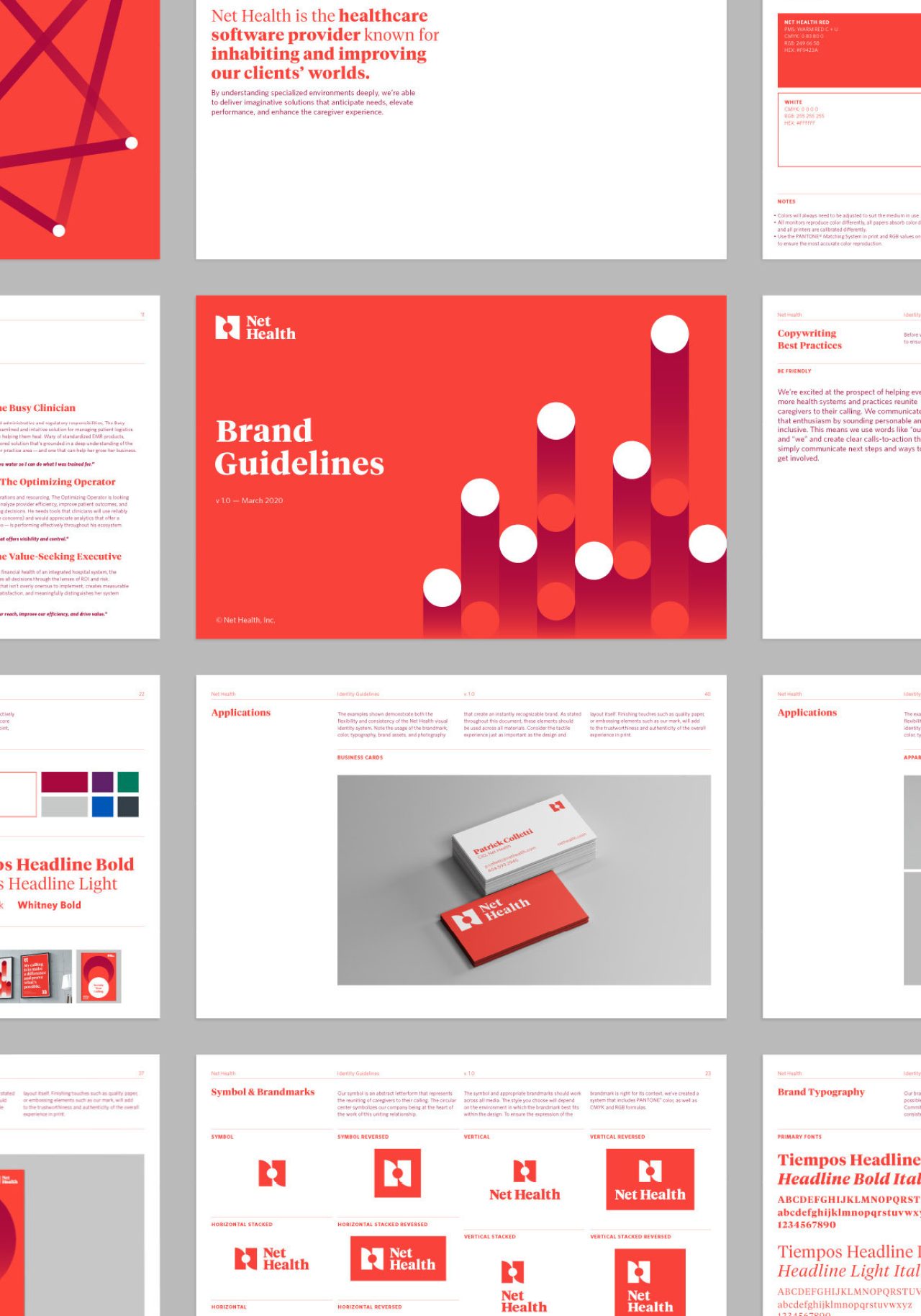
Healthcare
Industry