(Work)
Usalco
Unlocking the future of water, one innovation at a time.
Intro
Unlocking the future of water, one innovation at a time.
After years of innovation and growth, Usalco had become more than the aluminum-based chemicals supplier it was branded as. With mergers and acquisitions, new technologies, and private equity growth, Usalco needed a new brand inclusive of its work and ambitious with its future.
Working with the client team, we researched audiences and sought out commonalities. Across 8 different industries, Usalco works with a variety of businesses and municipalities—but they all needed the same thing. To unify the brand under one purpose and identity, we repositioned it as the catalyst for clean water. Change agents, pioneers, and trusted advisors in all things water.
Before
After
Under this new singular purpose, we expanded and organized the brand’s architecture while being inclusive of its many innovations and acquisitions. We changed the name from USALCO, an acronym representative of only part of the business, and made it lowercase. That way, the name’s meaning could exceed the original acronym’s narrow focus on aluminum, and its non-acronym pronunciation would be second nature to new clients and markets.
This new strategy and structure led to a full-scale modernization of the brand’s look and feel for future private equity-led growth.
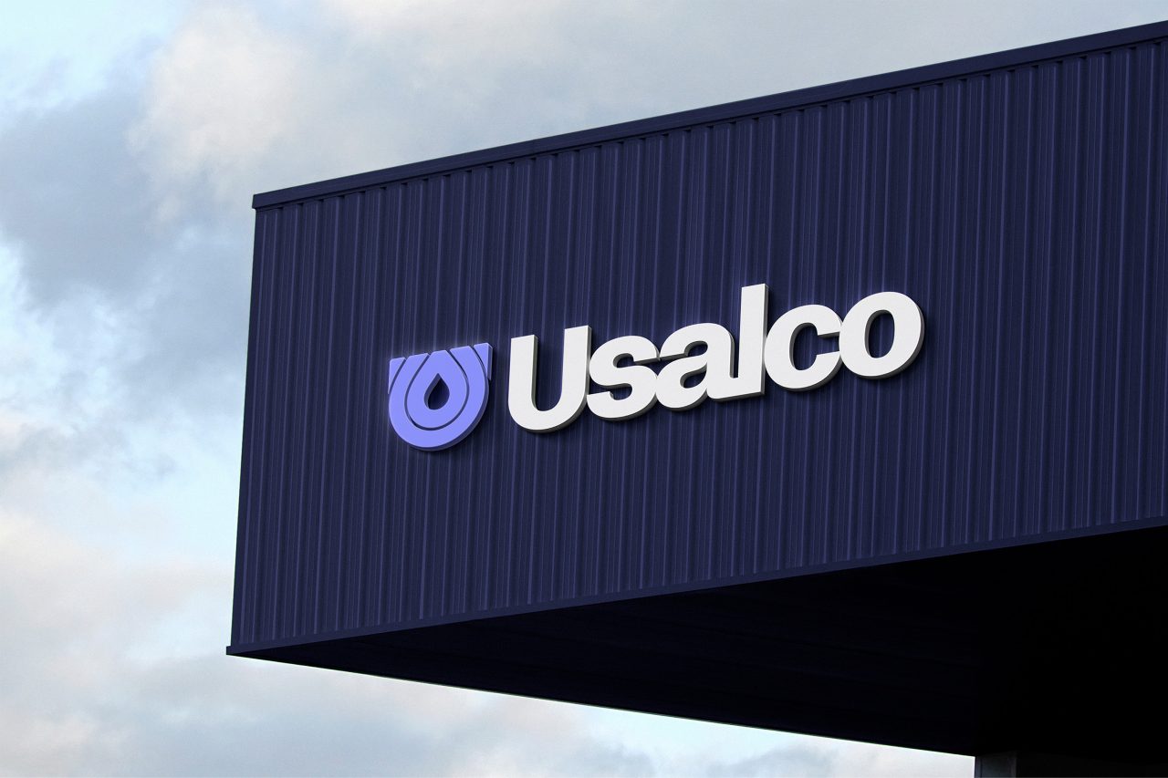
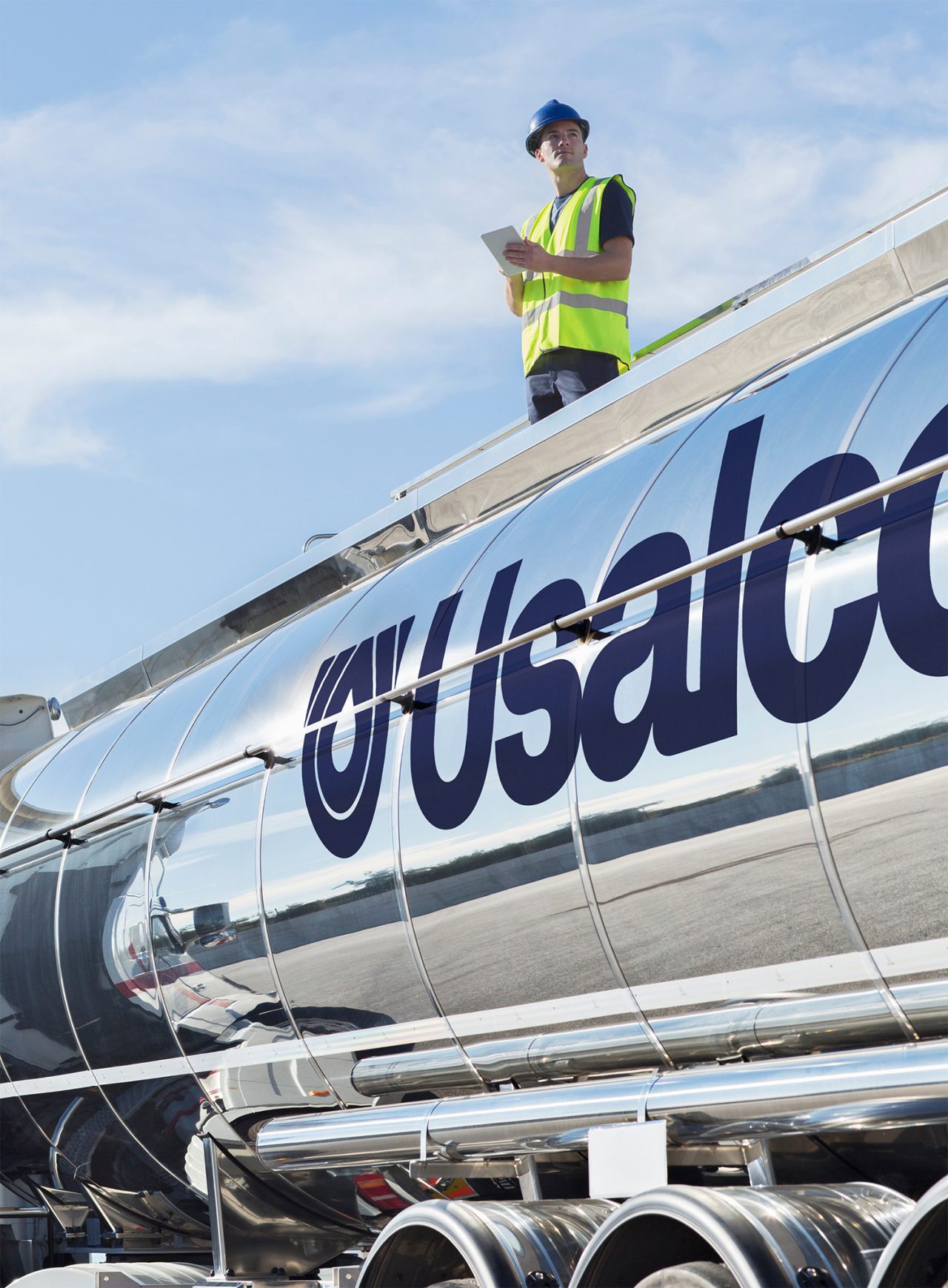
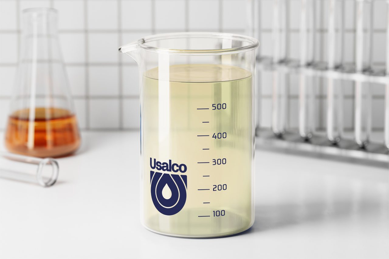
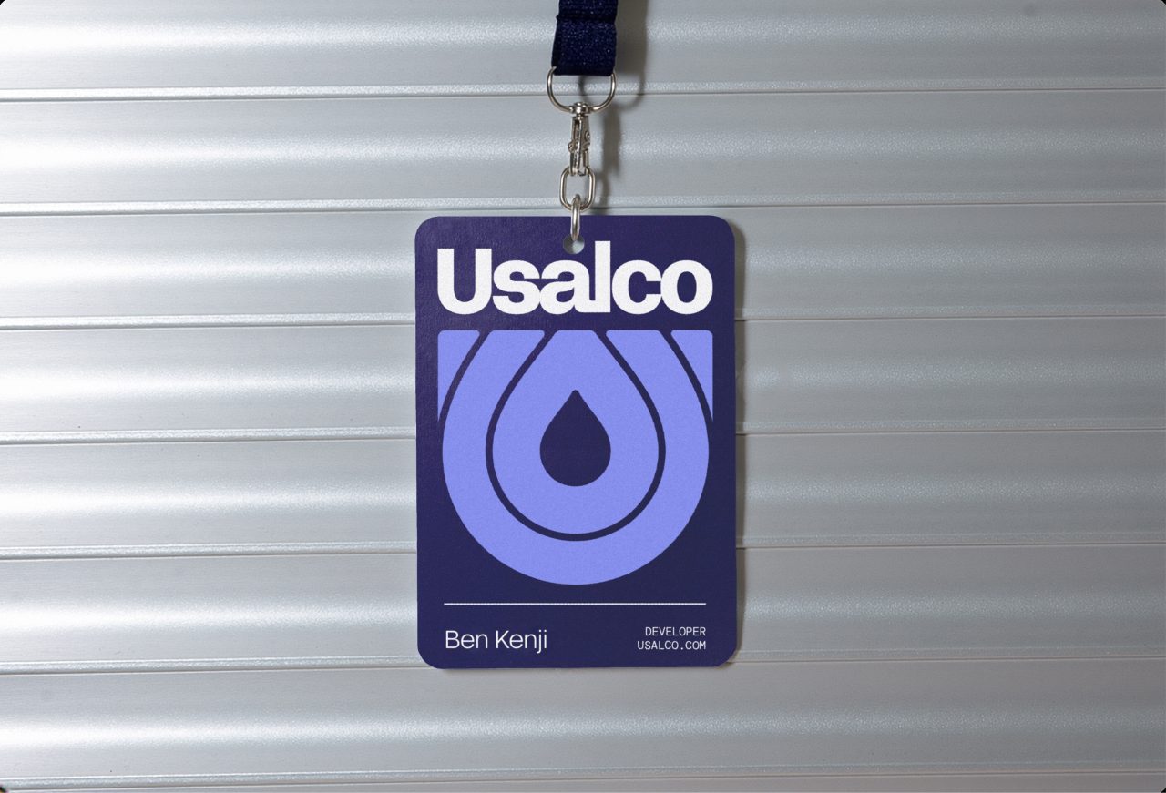
The logo, a combination of letterform and water droplet, puts the brand’s focus front-and-center while nodding to the impact or “ripple” made by Usalco on the water treatment industry. It’s designed to carry the brand everywhere. On trucks, cards, and more.
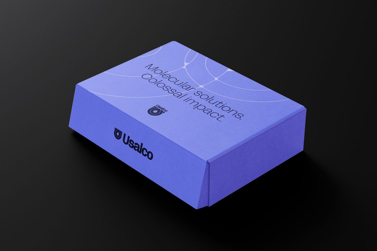
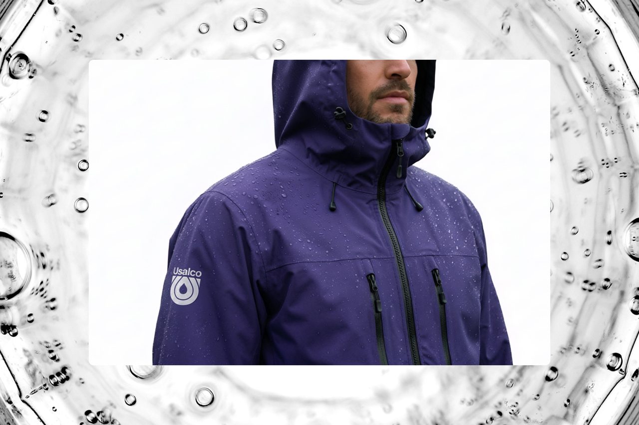
Usalco’s colors, a monochromatic exploration of purple, differentiates the pioneer from it’s red, white, and blue comparators, while lending the brand positive associations with other purple brands and industries in tech and innovation.
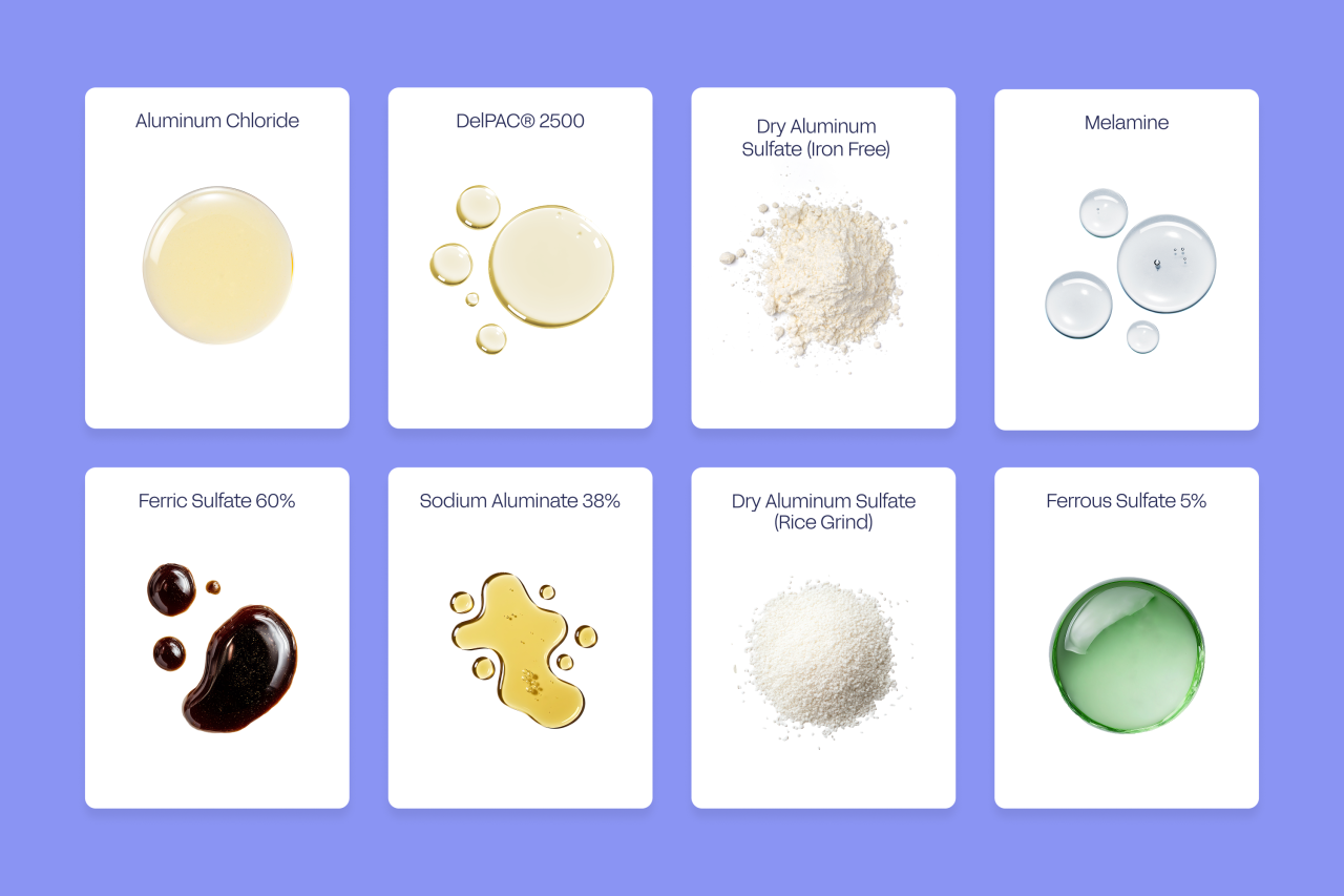
Every stage of the rebranded identity, was designed to scale and last. The brand’s voice and tone is invisible where it matters, relying on clarity and brevity to support the brand’s work and innovation-forward mission. The visual system is similarly designed to invoke clarity, using bold water-inspired visuals to communicate sophisticated new products, services, and data.
Combining an acquisition site with their legacy site, we led web strategy and design to reflect the new brand and improve the user experience.
The visuals are fluid and scientific. Product outcomes like coagulation and flocculation, are represented by water, ripples, and textured gradients. Graphical shapes, like the kind used in diagrams and graphs stick to each other to mimic the cohesive properties of clean water.
The brand’s pioneer perspective is declared simply in its headlines, and throughly in its clarifying articles and bullets. In photography, the brand’s greater purpose — clean water — is depicted literally, breaking from a long industry trend of depicting the dirty water these brands exist to solve.
For years, Usalco has innovated, acquiring new technologies and services representing many different companies. All of them crucial. Now they’re unified. Ready to grow even further in the pursuit of create clean water everywhere.
Ken Gayer, CEO of UsalcoOur refreshed identity captures the ambition and capability of the company we have become. As the demands on water systems grow and technologies evolve, our customers depend on partners who can help them navigate complexity with clarity and confidence. This identity gives us the unified platform we need to communicate our value, strengthen trust, and accelerate our next chapter of growth.
Credits:
Design by Cody Bass, Michael Martino, Sara Pepper, Gray Hauser, Colin Pinegar
Creative Direction by Brit Blankenship
Animations by Cody Bass, Sara Pepper, Michael Martino, Brent Clouse
Verbal Identity by Clayton Notestine
Brand Strategy, Brand Architecture and Naming by Ashley Quinn
Project Management by Lexi Joseph
Many thanks to the trusting and collaborative Usalco team: Trevor Hildebrandt, Ken Gayer, Jake Komarny, Brian Liotta, and Chris Lacey
Might we suggest

Brasfield & Gorrie
Case StudyArclin
Case Study
Paul Mueller Company
Case Study
Port of Lake Charles
Case Study