(Work)
Operation Humane
Building a house of brands animals and communities deserve.
Intro
The Atlanta Humane Society has always had a mission bigger than its brand.
As long-term partners, we were asked to take a fresh look at the brand after years of expanding its services. How does a legacy non-profit showcase that it has grown in scope and reach far beyond what its name might imply? Does the name create a big enough barrier to fundraising across Georgia to make a change? How does a newly spun-off veterinary brand work alongside the existing brand?
These questions inspired a close look at the existing brand architecture to determine the best path forward. Ultimately, we built a house of brands united by the same commitment to pets and the people who care for them.
Our work began with audits, surveys, and interviews to better understand the needs of the communities the brand serves with its existing perceptions. The findings were clear. Although the Atlanta Humane Society has a strong legacy of leadership, the current brand wasn’t signaling the broad impact it has across the region.
We recommended a house-of-brands architecture with three brands that have a clear focus and an identity to match. This will allow the team to maximize their impact and fundraising through clear storytelling in a way that the existing family of brands could not.
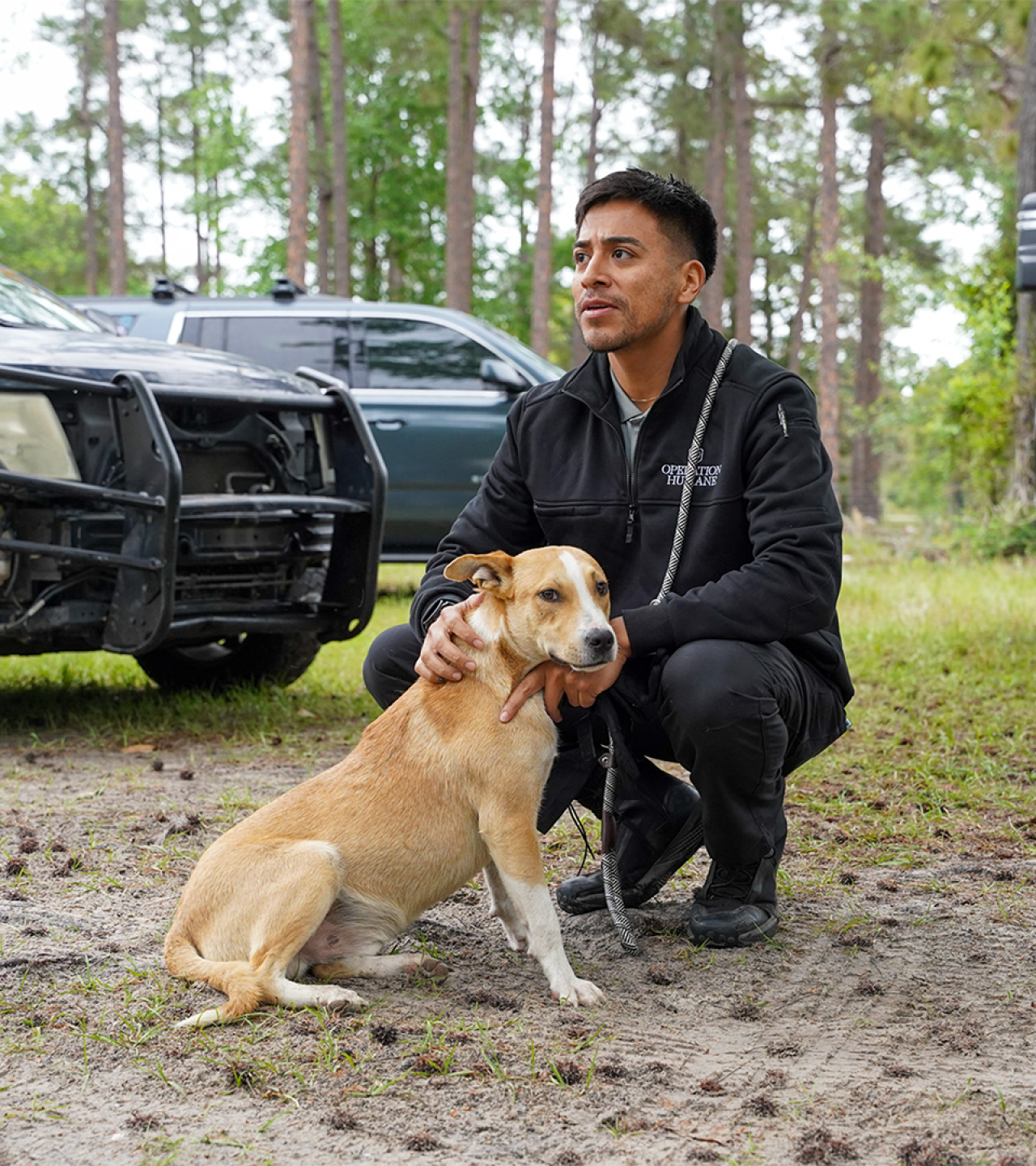
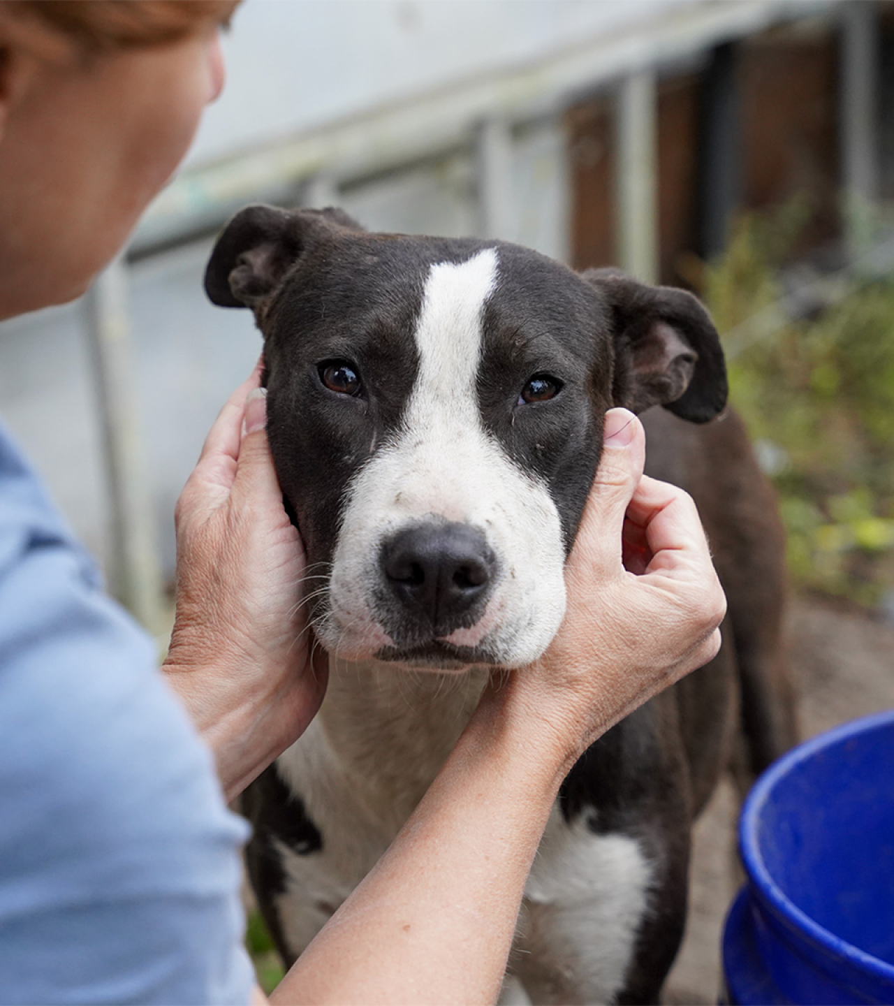
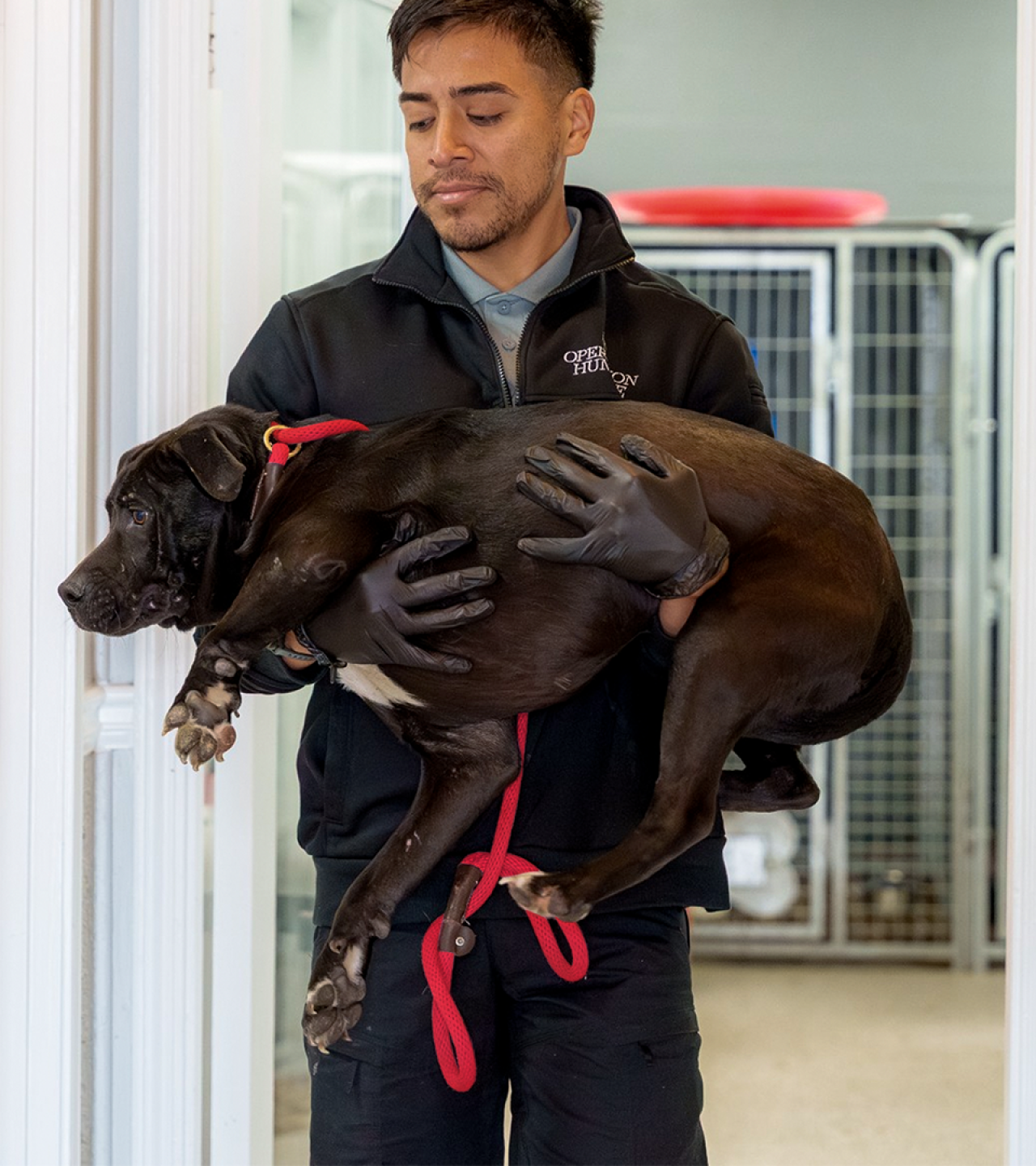
As the master brand, the Atlanta Humane Society remains the local leader, shaping the future of animal welfare by supporting pets and their people. Remedy, operating as its own non-profit organization, is a clinical care brand that delivers at-cost veterinary services, while the newly created Operation Humane brand focuses on animals and communities in crisis.
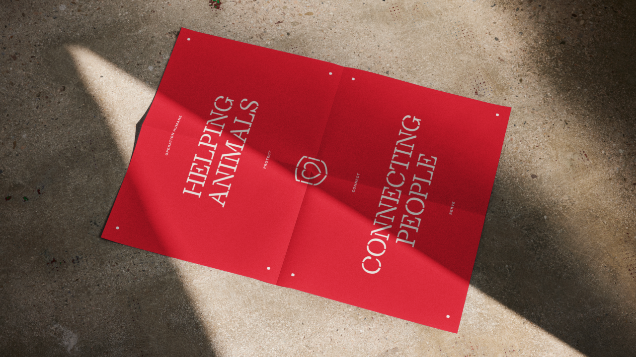
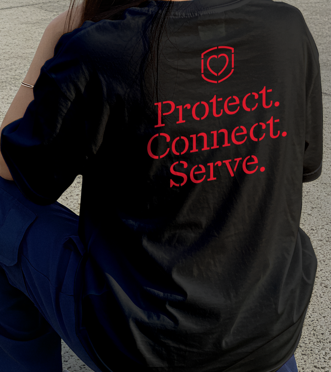
Helping animals through collective action, from cruelty investigations to disaster relief, the name “Operation Humane” captures the immediacy of animal rescue in the Atlanta Humane Society’s house of brands. Its core message, “Protecting Animals. Connecting People,” aligns it with the parent brand.
In the larger house of brands, Operation Humane’s visual identity balances compassion and care with strength and action. Here, the familiar red and heart motifs of the Atlanta Humane Society are mobilized. For example, the heart—a symbol of the Atlanta Humane Society's compassion and care—is strengthened by a shield. The typography is big and bold, leading the sub-brand with calls to action. This approach is inherited from the Atlanta Humane Society’s clear and communicative approach to animal welfare.
Operation Humane’s other major theme is its boots-on-the-ground approach. We used only hardworking, accessible materials from the community—on rescue vehicles, patches, and flyers. Headlines use stenciled type like street markings and signs. Textures such as cardboard, metal, and concrete give a hands-on feel. The shield icon appears everywhere: as markers, points, or holes in animal crates.
Despite feeling standalone, especially in the field, Operation Humane is tied to greater efforts of the parent brand and its community partners. For that reason, we designed a visual language for logo lockups that leverages the Atlanta Humane Society’s legacy and reputation without limiting the stories these brands can tell about different collaborations and services.
In the end, this new house of brands gave the legacy non-profit new ground to build on. Each brand is set to grow with renewed focus and clarity, serving more animals and providing more care in ways that one brand or a family of brands could not.
Credits:
Designed by Michael Martino, Sean O'Connor, and Cody Bass
Strategy by Ashley Quinn
Messaging by Clayton Notestine
Creative Direction by Brit Blankenship
Project Management by Melissa Kruse
Special thanks to Mike Robbins and Christina Hill at Atlanta Humane Society
Might we suggest
A CMO's Guide to Preparing for a Rebrand
ArticleArclin
Case Study
The Atlanta Journal-Constitution
Case Study
UPS Illustrations
Case Study
Tensure
Case Study
Brasfield & Gorrie
Case Study