(Work)
Hotel Colee

Intro
We worked with Woodbine Development Partners to design a fashion-forward identity for a hotel in the heart of Buckhead, Atlanta’s unofficial catwalk.
Taking over the former W Hotel Buckhead space, the revamped property presents itself as the perfect excuse to live it up.

This new icon in Atlanta’s skyline needed a new name, and we created Hotel Colee, a handle that feels feminine and cheerful, without sounding childish.

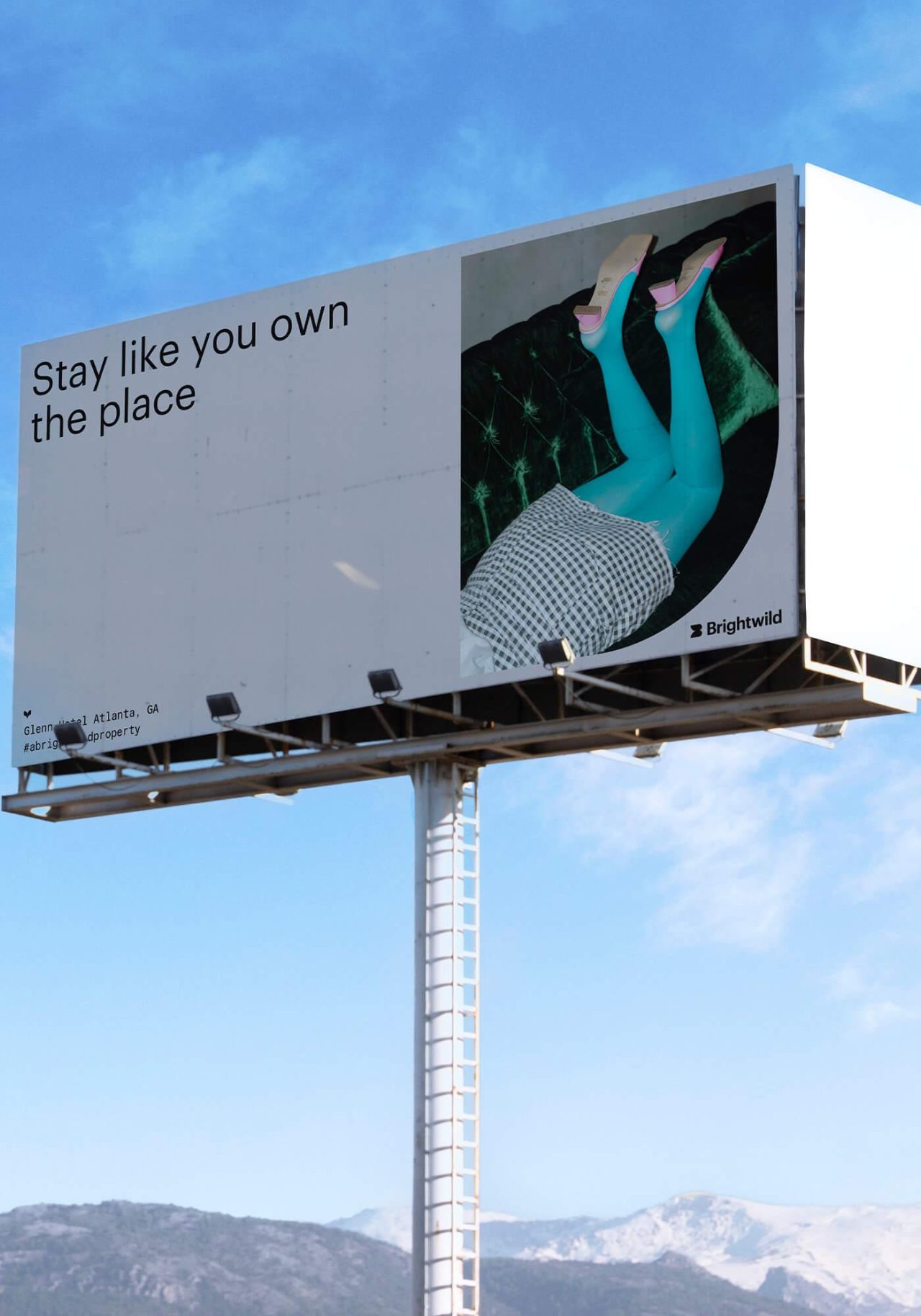
Hotel Colee attracts an audience ranging from business travelers with a discerning eye, to locals looking for a trendy staycation hotspot. With celebration as Colee’s central theme, it only made sense for us to create a brand heaping with Southern hospitality, youthful energy and style for days.

A hefty typeface accentuated with lighthearted script adds more energy to Hotel Colee’s signature style.


The hotel’s palette leads with a warm orange set against luscious yellows and pinks, and deep greens and blues that all play together harmoniously in unlikely combinations.

Signature flourishes, swashes and filigree provide a framing device that feels vintage, but looks modern.


Hotel Colee caps it all off with brand voice and messaging that drops pop culture riffs, ATL slang, and cheeky wordplay.


Since making its debut Hotel Colee has kept the party going, earning a nomination as one of Travel + Leisure’s 2021 “World’s Best,” and being named “Best Atlanta Staycation Destination” by Jezebel Magazine.
Might we suggest


Midtown Union
Case Study
Naming
Branding Services
Trilith
Case Study
Casinos.com
Case Study