(Work)
HCM
Design for real
Intro
There’s power in purpose
No company is static. They adapt to the seasons and roll with the punches, growing and changing over time. That often means they outgrow their identity … or grow into a new one. That was the case for Hord Coplan Macht, a celebrated architecture and design firm with an opportunity far bigger than their existing brand. Our job? Help the HCM team build a brand bold enough to capture their vision for the future.
From the start, the team was eager to signal a moment of evolution for the firm. Despite a proud legacy, widespread regional recognition and a strong cross-industry portfolio, the brand felt rooted in the past. Teams felt siloed, the positioning was undifferentiated, and brand equity was concentrated in a few corners of the business, far from the unified front the firm was eager to present to the market.
Brand strategy doesn’t usually come easy, but sometimes the answer hits like a bolt of lightning. What makes HCM different isn’t the designs they create or the industries they serve, but how they treat the people they work with. For starters: they actually listen. It’s the foundation of their longstanding partnerships, reflecting a commitment to practical impact and design with substance. The folks at HCM recognize the driving force for their clients is the community they’re committed to serve. For school districts, healthcare providers, and civic leaders, every design is an opportunity to build a legacy.
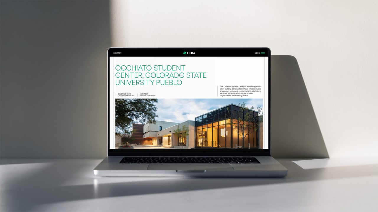
The first and most critical step was formalizing the name change from Hord Coplan Macht to HCM. The idea was to better position the firm for the future without losing sight of its legacy, embracing the name most clients and communities already knew them by. Also key: ditching the law firm/accountancy naming structure and embracing the flexibility of the shorter, sharper moniker. It’s no spoiler to note it also makes for a much stronger logo.
John Lange, Senior Director of Strategy and Marketing at HCMThey went above and beyond understanding what makes us unique, and somehow, found a way to perfectly convey that both verbally and visually, without seeming like a typical trite brand strategy.
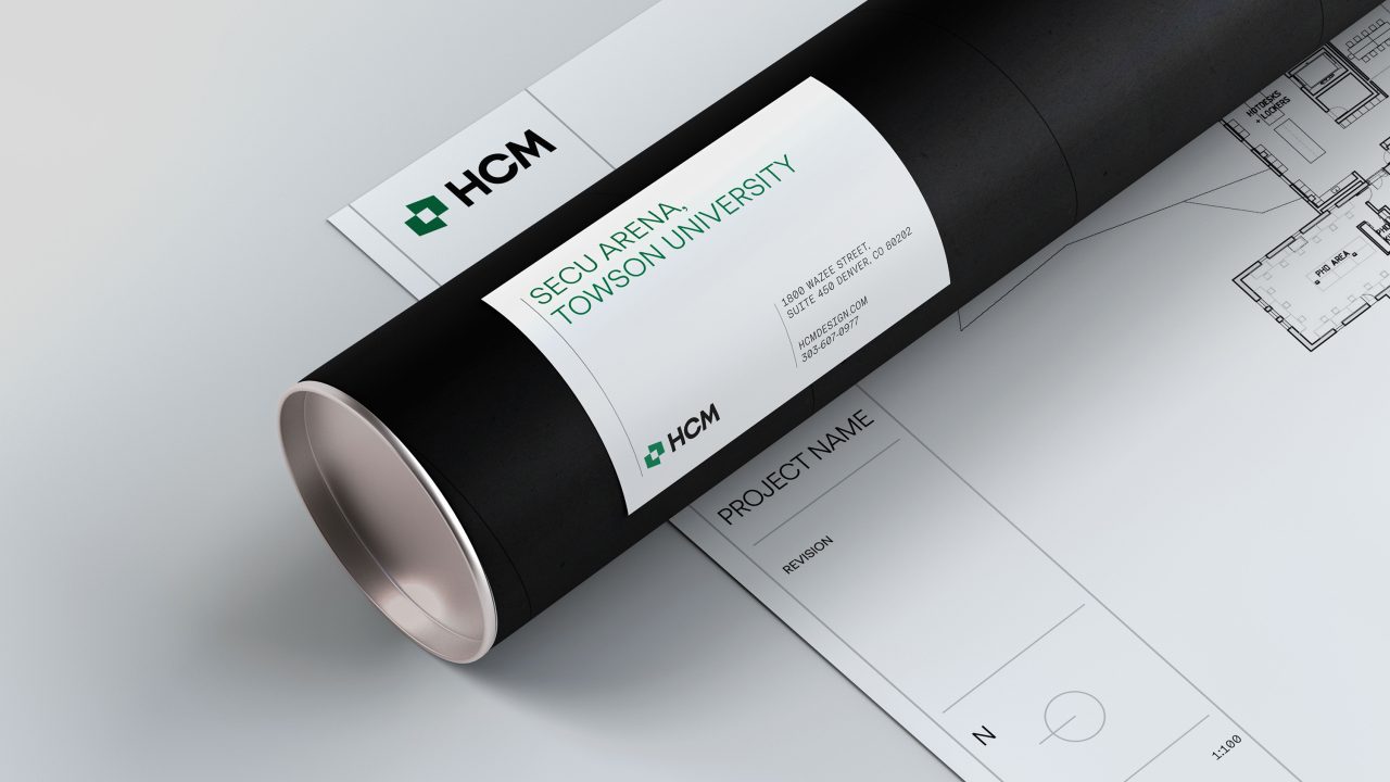
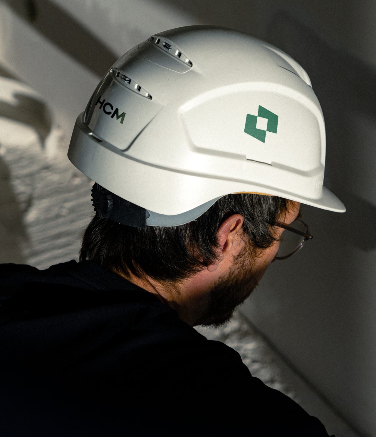
The logo itself is an ode to collaboration, using overlapping shapes to highlight the open space where design and communities come together. The system makes use of detailed linework throughout, giving the visual identity a clear link back to the design legacy at the heart of the firm. Last but not least, green. The new core color is a standout in the industry and a drastic shift that defined HCM for decades, giving the entire brand a refreshing feel to match the new vision.
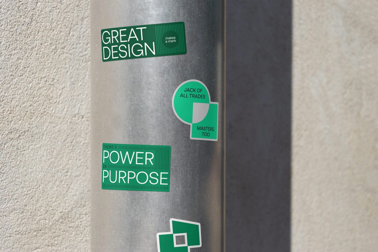
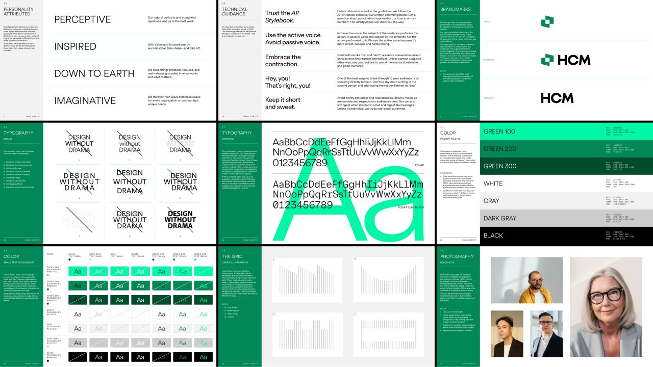
The new HCM voice is sharp and incisive, intended to communicate a distinct point of view — something many design and architecture firms struggle with. We helped move away from academic and aspirational language that dominates the space, building a sharper, more incisive language system that reflects the belief design is about substance more than style. Signaling pragmatism and creativity in equal measure, it’s a verbal identity that truly reflects the team behind every project.
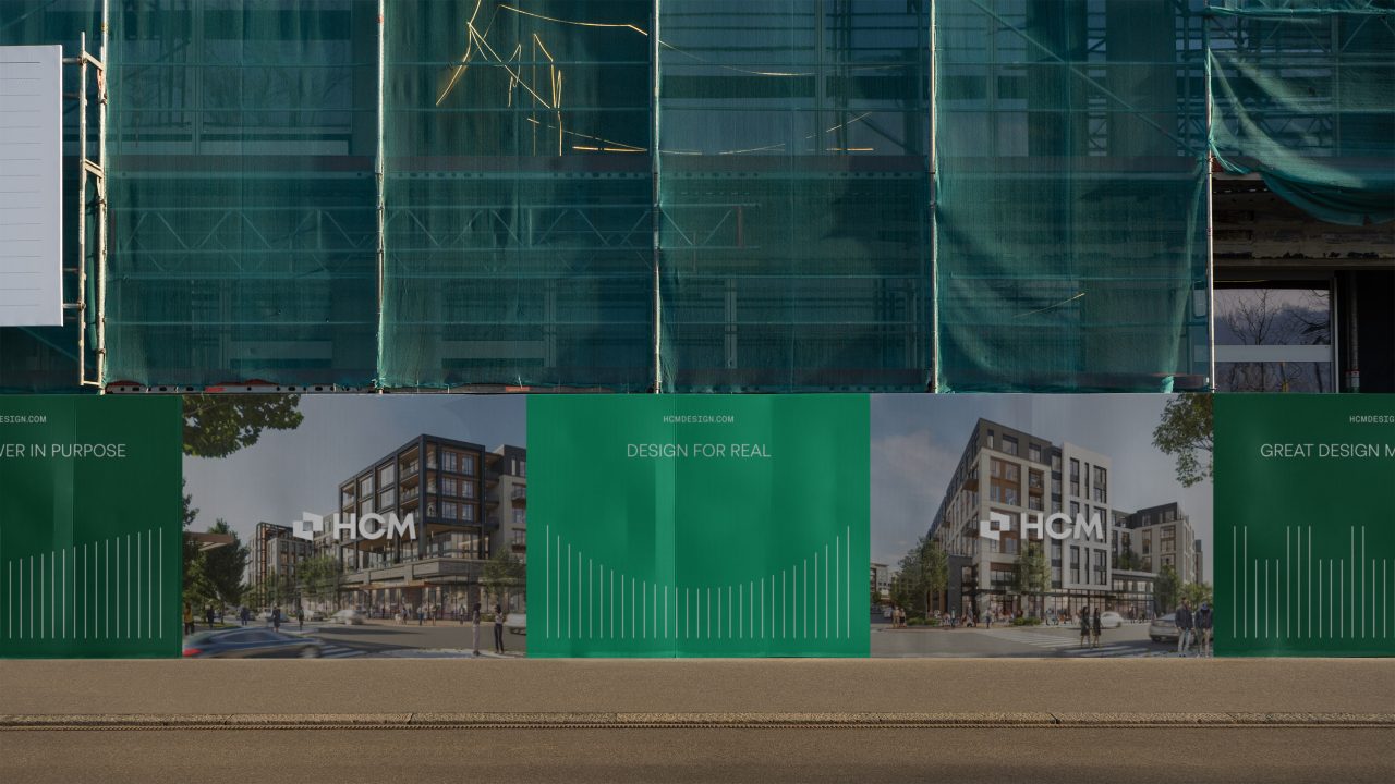
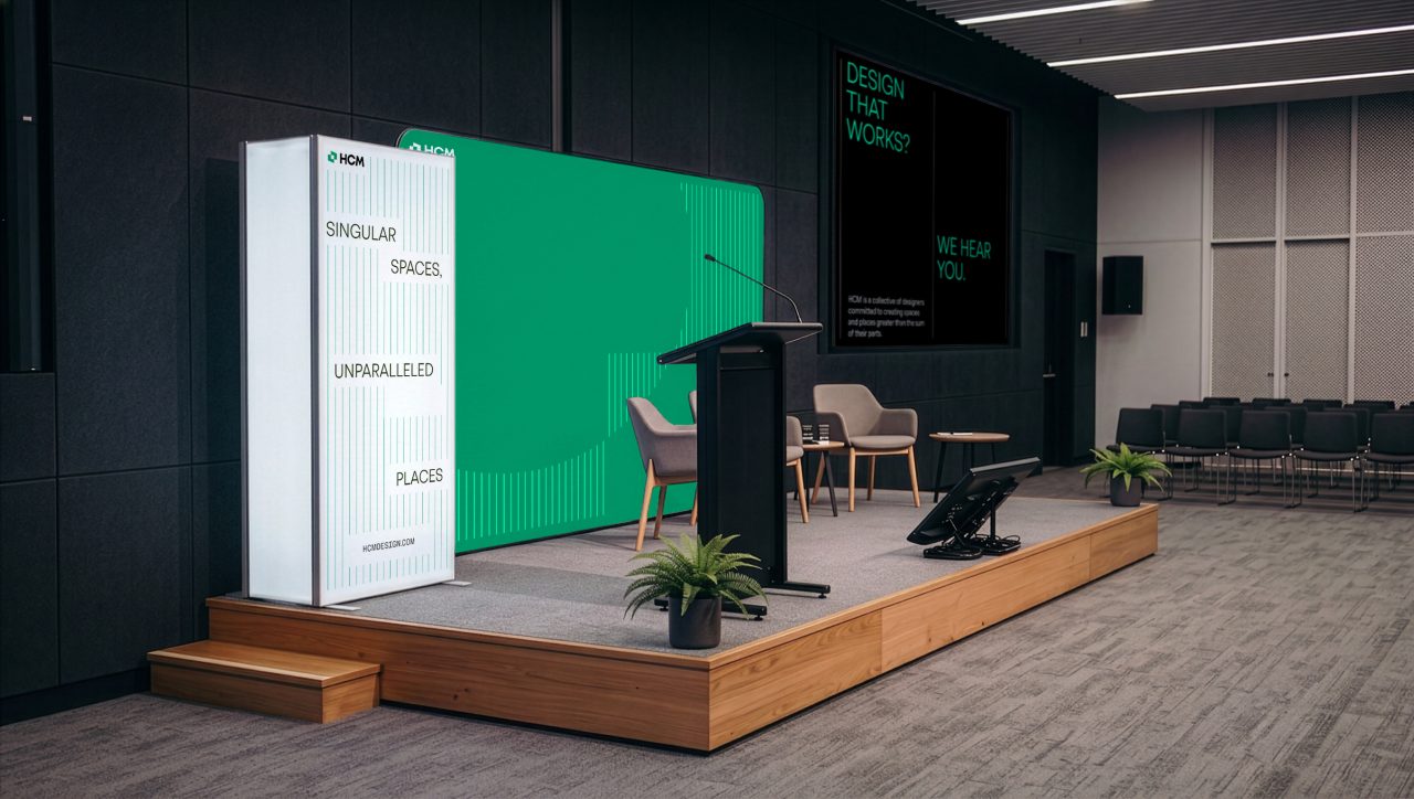
The new brand is both a celebration of achievement and a reach into the future, shining with the same energy and focus as the designers, planners, and architects who call HCM home.
Credits:
Designed by Christian Tompkins and Michael Martino
Strategy by Dee Boyle
Messaging by Cam Leberecht
Design Direction by Reid Parsekian
Project Management by Lauren Hood
Brand video by Brent Clouse
Animations by Max Prince
Special thanks to John Lange and Sharon Pula at HCM
Might we suggest
A CMO's Guide to Preparing for a Rebrand
Article
Arclin
Case Study
The Atlanta Journal-Constitution
Case Study
UPS Illustrations
Case Study
Tensure
Case Study
Brasfield & Gorrie
Case Study