(Work)
WestRock
Repackaging a Sustainable Leader

Intro
WestRock is a global leader in paper and packaging, transforming next-generation ideas into sustainable solutions.
Equipped with a new purpose statement to “Innovate Boldly. Package Sustainably,” WestRock came to us looking for an evolutionary visual update to better reflect their vision for the future.
As a Fortune 500, WestRock serves a variety of industries, from craft brewers to luxury goods, and needed a visual system agile enough to support sales, product and digital marketing, corporate communications, and more. We worked closely with their in-house brand team to build a flexible system on top of their existing logo and core colors.


Streamlined typography, new graphic elements, and secondary colors help simplify the visual language to remain fresh in any setting as it dials up or dials down various elements. The expanded color palette has reserved and mature hues, while also containing bright and bold tones for more expressive use cases. The new primary graphic asset is a dynamic chevron pattern that was designed with ease of use in mind. Furthering the minimal linework style are new spot illustrations and technical drawings.
We created rules and systems for everything from photography to iconography to social assets and marketing templates. Additionally, we hosted trainings and workshops to empower team members to create “on-brand” communications. By working closely with the WestRock team, their updated visual language is easier to use, more flexible, and better points towards their bold vision.

Kelly Fowler, Global Head Creative Services + Brand Identity, WestRockOur updated visuals are simple yet striking, allowing us to effectively communicate who we are to the world. Matchstic was a trusted partner through every step of the process.
Might we suggest

Avidxchange
Case Study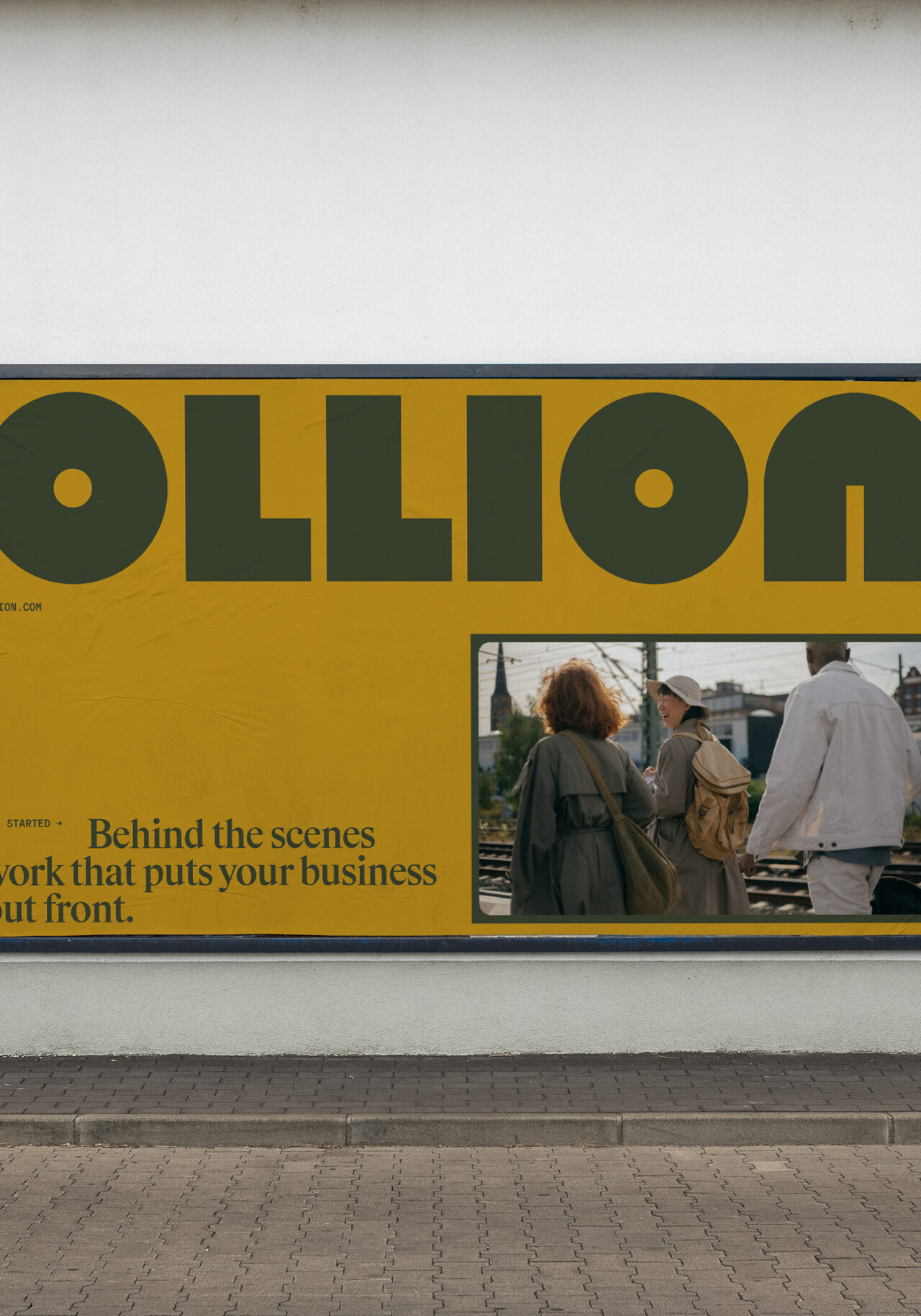
Ollion
Case Study
UPS Brand Photography
Case Study
Fountain
Case Study