
(Work)
Novo
Living In Abundance

Intro
We teamed up with Stiles to create an artfully-inspired identity for the residences within its signature downtown property, The Main.
Spanning an entire city block, The Main is located on Fort Lauderdale’s famed boulevard, Las Olas.

First, the community needed a name that could be distinguished between The Main’s adjacent retail and office space. We landed on Novo, Latin for “new” and a nod to the nearby New River.
Novo’s brandmark mirrors the building’s two prominent towers, with organic lines adding motion and fluidity.

Because local art features prominently throughout the property, we made a custom texture, drawing from real art installations as a base layer for textures, and a window for a variety of images.


Novo’s neutral palette is accentuated with bright bursts of color, used sparingly throughout the system, in flourishes, outlines and stickers intended to imitate old-school price tags.


The result is a modern, imaginative look for Las Olas’ landmark property.

Might we suggest
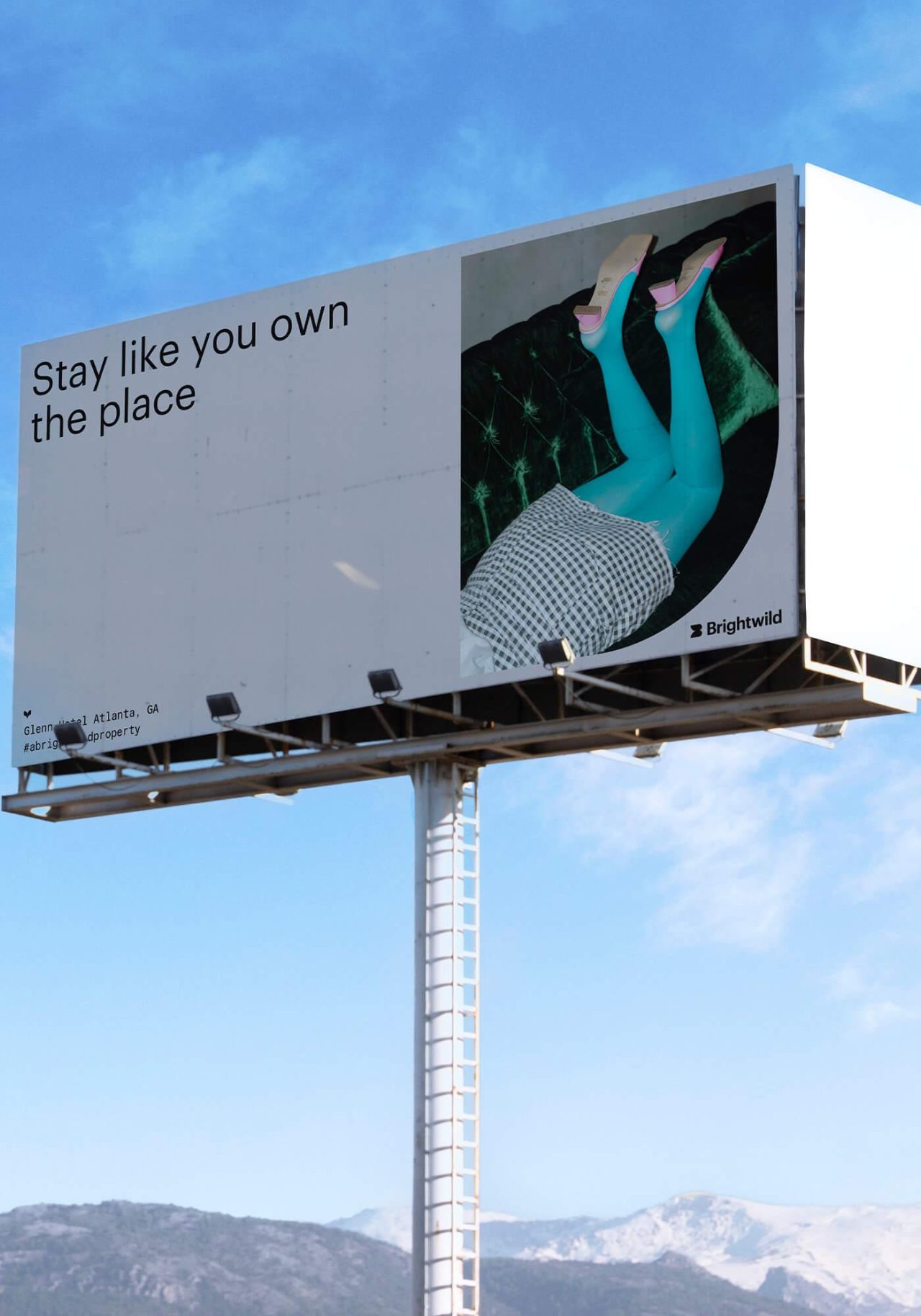
Brightwild
Case Study
Elan Sweetwater Creek
Case Study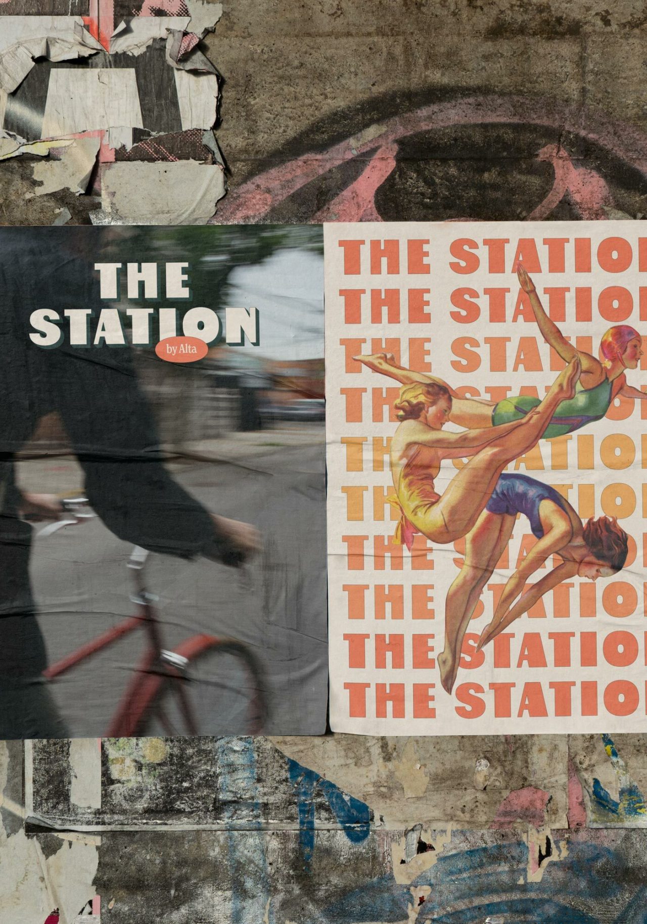
The Station
Case Study
Midtown Union
Case Study