
(Work)
10 Tampa Bay
Tune in curious.

Intro
For years, 10 News was stuck in the middle of their local pack.
We helped the station stand apart with a new name, a radical new look, and a clear central focus.

A CBS station based in Tampa Bay, 10 News had a history of varied taglines, approaches, and network affiliations. In 2019, they found themselves saddled with a misleading name, a muddled visual identity, and a lack of consistent viewer loyalty. But their team of storytellers yearned to dazzle with something different.

Before

After
We started by establishing a unique and ownable position for the station. In a noisy market filled with disjointed stories, they would offer “deeper dives and sharper insights.” But that wasn’t the only change. Since news wasn’t the only type of programming they offered, we helped the team rally around a more appropriate name: 10 Tampa Bay.


In a market awash in red and blue, our design team introduced a refreshing teal and an elegant geometric mark with confident, radiating linework that nods to the layers of a well-told story. The distinctive shape, with its precise intersections also served as an ideal supergraphic across some imaginative applications.


To match the new look, we provided accompanying messaging emphasizes the station’s mission to provide clarity, context, and confidence. Taken together, the approach is a dramatic standout in Tampa—and a huge leap forward for the brand.
Might we suggest
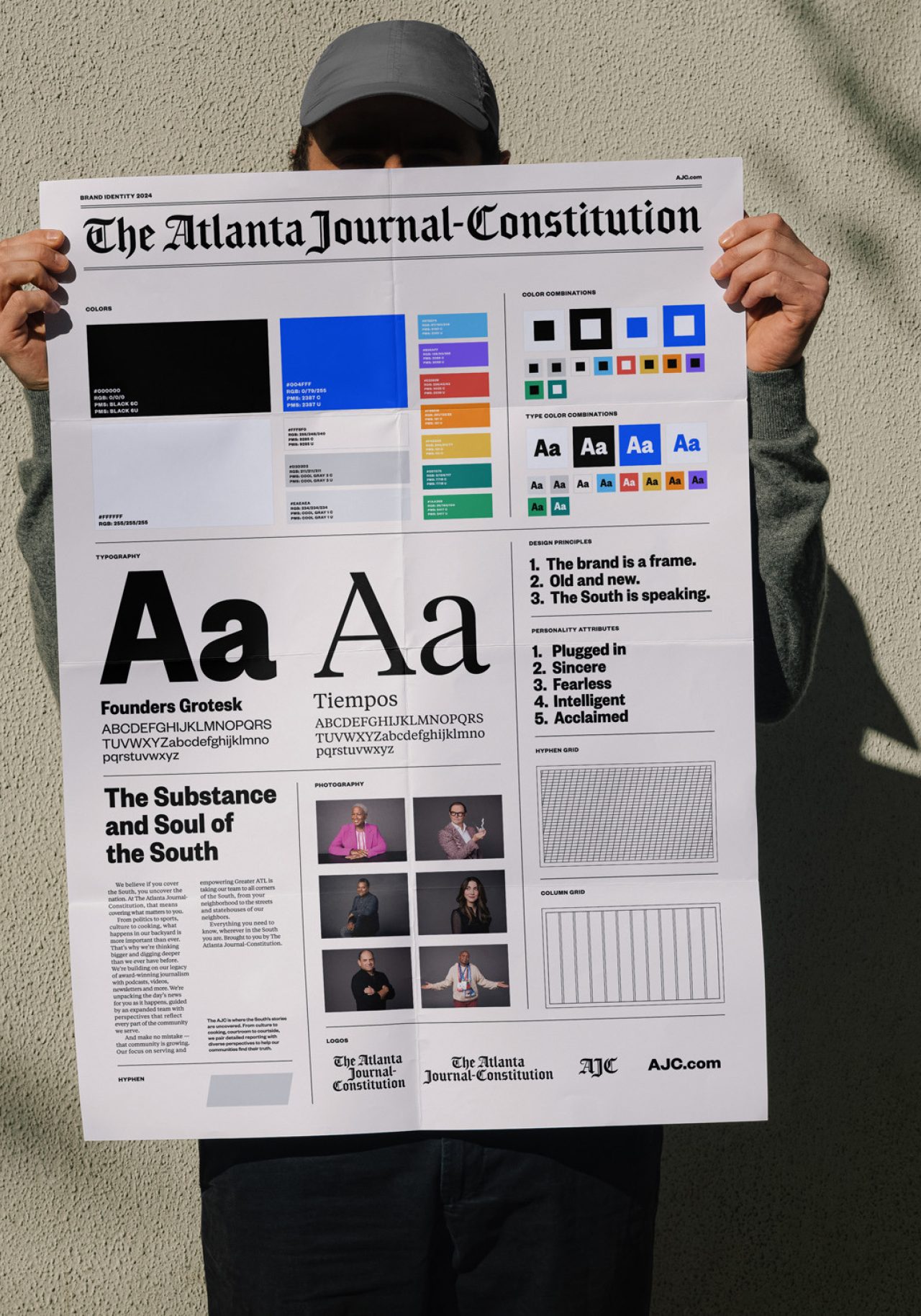
The Atlanta Journal-Constitution
Case Study
CBS Philadelphia
Case Study
WABE
Case Study
Brightwild
Case Study