
(Work)
Atlanta City Public Notice Signs
Taking the city from complex to clear

Intro
To be clear is to be kind.
To better engage the citizens of Atlanta with all the development happening around the city, the Department of City Planning came to us to help them redesign their Public Notice signs.


You know the ones we're talking about—those convoluted eyesores around town that are difficult to read and impossible to understand.
We were tasked with improving the legibility of these outdated notices by providing a cleaner, more beautiful way to communicate with the community.
Our solution was to design a clear visual system, one that is unexpectedly engaging and flexible for future expansion. We also created a legible, consistent visual hierarchy that distinctly identifies the notices by assigning each one a single letter.


The colors were refined to reflect what our flourishing city represents, boldly framing each sign, no matter its backdrop. In addition to color, the notices use the Department of City Planning’s new logo and typefaces, refreshing and modernizing their look and feel.
The finished pieces can now be seen throughout Atlanta—everywhere progress is taking shape—bringing clarity where there was once confusion and indifference. We don't know about you, but we smile every time we see one.

Tim Keane, Commissioner, Atlanta Department of City PlanningAs the City of Atlanta, everything that we design should be exceptional. The city is responsible for setting the standard of work that is representative and worthy of contributing to Atlanta. We’re in the process of evaluating ourselves to ensure we are clear and concise in all that we do.
Might we suggest
MARTA
Case Study
Not Buying It
Case Study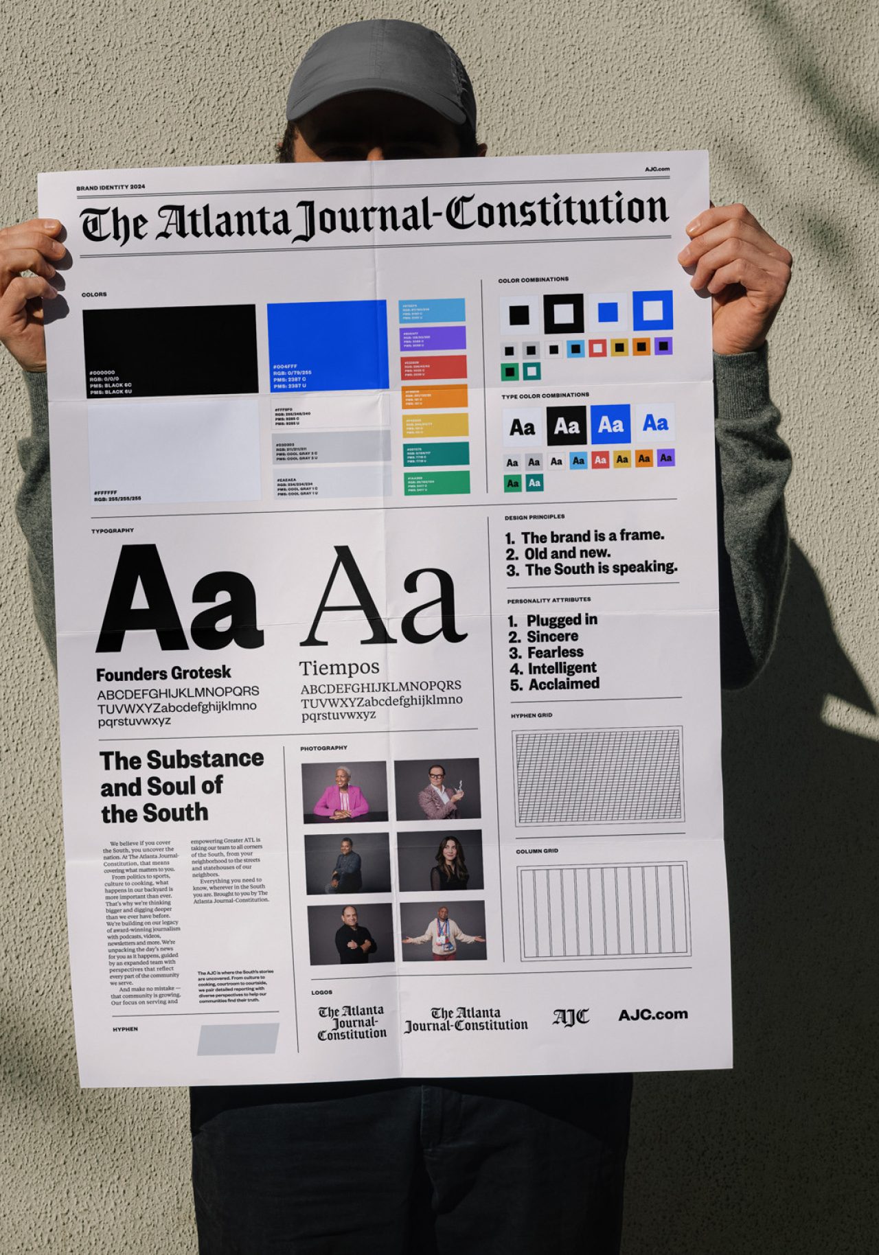
The Atlanta Journal-Constitution
Case Study
The Breman
Case Study